Tuesday, October 14, 2014

Assignment #2 - Ryan Cummings


I wanted to do a little word play (ok maybe not the right term) and make the viewer think for a second to understand the meaning of the image.  There is no telling where this road leads or what obstacles may be obstructing a safe and easy journey.  The phrase "I haven't the foggiest idea" is commonly used, but it also applies to what we see in this photograph.  We don't always know what lies ahead.  Although we may have a guess or assumption as to what our future holds, we very often have no idea where a path may lead.

I commented on the posts of Ciera Keller, Todd Bean, Lexi Erickson, Stefan Van D Graaf, and Austin Page.

Assignment 2 -- Heidi Ertel -- Consequences


I took this picture about a year ago when I was in Europe.  One Sunday afternoon, I went to the Dachau Concentration Camp and walked through.  The entire compound was somber and although there were many guests, it was eerily quiet. However, that mood changed when I entered the Crematorium.  I felt as if I was being suffocated; I couldn't breathe.  The atmosphere was really heavy and dark.  It felt as if the quiet of only a few moments before was a roar with how dead silent it was inside the Crematorium.  It was as if the weight and magnitude of the events that happened in the Concentration Camp, as well as the many others, had been thrust upon my shoulders.  Even though it felt so wrong to even breathe, I managed to snap a picture or two to document what I had witnessed.

I have never forgotten those feelings.  They haunt me.  That's why I selected this message.  I wanted people to see and feel what I felt.  I wanted people to look at the Holocaust and remember.  I wanted them to apply it in their own lives.  The Holocaust isn't something of the past.  It happens every day.  Every day there are victims.  Every day there are wrongdoers.  And every day, there are those who stand there, and let it happen.  Look at those actions in the context of the Holocaust.  Now think of the consequences.  We don't need to let different versions of the Holocaust happen every day.  We can change that.

In the photo, I increased color saturation, and, although it was much darker in real life, my camera significantly washed everything out, so I tried to somewhat recreate the actual site.  Along, with the photo, I chose the quote by Yehuda Bauer to help portray those powerful feelings.  Instead of leaving the quote as one sentence, however, I put a period at the end of each line.  I wanted what was said to ring out as if a gavel had been struck before moving on to the next idea.  For the font, I chose "JohnHancockCP" in bold.  I wanted the words to appear heavy and portray the weight and enormity of the events that occurred in that room.  I chose black so that the words would appear visually heavy and take up the space. It also adds to the grimness. I selected the title "Consequences" to give viewers something to think about in the context of both the Holocaust and how similar actions might influence our own lives. 

I commented on the assignments of James Birdsall (Come Unto Me), Taylor Ricks (Escape), Clarissa Oliphant (Tis' the Season), Jordan Wheeler (Drown), and Collin Gingrich (Breathe).

Project #2 | Stefan van de Graaff - "Go to the Mountains"


The Church has a proprietary font that they use for the name of the church and things like the sign outside temples. Probably the closest font is called Trajan Pro 3. I used a brownish color to bring your eye down the page, and the particular font to connect the copy with the font on the sign. "Go to the mountains," is a quote from President Worthen's inauguration. I find that this picture, depicting two types of mountains, accurately portrays President Worthen's meaning in his quote. Lastly, I chose to align the copy to the right side of the page as that's where Squaw Peak and Moroni point.

I commented on Miranda Facer, Jordan Miki Wheeler, Clarissa Oliphant, James Birdsall, and Taylor Ricks photos.

Assignment # 2 Hailey Topham


I took this photo at thanksgiving point by the corn maze.  I used the font amatic because it reminds me of words like adventure and travel.  It has a light and almost whimsical feel to it through its simplicity and slightly crooked lettering.  The words are place in a way to show there isn't one destination to adventure.  It is just out there in the distance waiting to be discovered.  When I look at this picture I see how big the world is.  Just behind me there were restaurants, offices, and a movie theater.  But in this frame I was able to capture a spacious landscape, full of possibilities.  In Utah we are surrounded by mountains.  If you take the time to look at them for a minute, you will feel the world stretch around you, often changing your perspective.


I commented on Tanner Wadsworth, Jordan Miki Wheeler, Maren Owen, Samantha Williams, and Clarissa Oliphant.

Assignment #2: Miranda Facer

"Name Unknown" by Miranda Facer
I took this melancholy photograph on a beach in California last summer. I didn't make any edits to the original photo other than adding text. 

The text is justified to the center towards the top where the eye is naturally drawn. This is the focal point because of balance (half sand, half sky) and perspective (the ridges in the sand create upward  sight lines drawing you to the center). I used Gill Sans MT because I liked the clean, stark lines and thought they matched the simplicity of the message. A sarif would've felt too forced here. I chose to bold "ache" to add emphasis on the emotional nature of the photo. 

My call to action for the viewer is implied; I hope when you see this photograph you put yourself in the narrative and think of who or what your soul aches for.

I commented on Mallory Jesperson, Brett Bertola, Sterling Randle, Jenna Randle and Hannah Childs

Assignment #2 - Jessica Smith "Jerusalem Changed My Heart"


My heart was changed this summer. I spent almost four months exploring the city of Jerusalem, most of Israel, and parts of Turkey and Jordan. One of my professors read this quote from the picture at the beginning of our trip and it stuck with me. I thought of it many times as I made my best effort to allow Jerusalem to pass through me, and not simply to pass through different places. Because of my experiences learning more about my Savior, the sights I saw, and all of the incredible people I met, my heart truly was changed.  

      I used the font "Sue Ellen Francisco" because I felt more of an emotional connection when I read the quote in that font than in any other. I wanted this picture taken because for me, it symbolizes so much. I set the picture up by describing to my friend just how I wanted it to look, and he took it for me :)

Assignment #2 Austin Page-We the People


This picture isn't your regular rectangular capture of a moment. Rather, I wanted to capture many centuries of time in a phrase instead of a frame. I decided to use these 3 simple words, "We the People" because they resonate with many people within the United States. There are thousands of families who, still to this day, are sacrificing the company of their loved ones to protect and defend the freedoms that have been established. God bless america!

I commented on these people's pics: Becca Harpster, mallory jepperson, M'Leah Ricker, Brett Bertola, and Morgan Linford. 

Assignment #2 Tanner Wadsworth: Hermetic reflections


This picture of one of my favorite places in Montana reminded me of an ancient saying, which I don't even remotely understand, but sounds profound. I intentionally reflected the top line of text to make the visual surprising: normally our eyes would expect to see the bottom distorted. I tried to pick a font that would match the pristine feeling of the photo. This is Myriad Pro, which I thought looked good.

Assignment #2 - Alex Skinner - Rocknrolla

Rock N' Roll is a the freedom of expression. I decided instead of using a certain font that I should use freehand. However freehand can be lame without a purpose. What I noticed with this image is the their were specks of lights that already formed the R's the C and the two L's. I used the smudge tool to emphasize the subliminal message that was hiding in the lights. The phrase is also a perfect mirror of the body's motion. The text move from top to bottom right to left, and the body moves from top to bottom left to right creating an X. Rock N' roll also tells the story. The actor rocked and it appears that he is falling into a roll. The body and R in roll are like crashing waves, the body about to absorb the roll. Since Rock N Roll is "anti-establishment" at times, I felt it was necessary to have an "anti-establishment" font... which was emphasized freehand.

Commented on: Courtney Johansson, Colin Gingrich, Jordan Wheeler, Clarissa Oliphant, Taylor Ricks.

Assignment #2: Plant a Garden--Carrie Duford

The reason I decided to create this visual is because of my own short comings. I hate gardens. I can't stand them or having to work in them, but my husband is a plant-lover. He has a whole indoor garden dedicated to various types of herbs. He loves his garden and makes sure that the plants have all they need--water, sunlight, etc. His example has helped me to better appreciate a garden. And now I issue that call to you. :)
The visual elements that are displayed are high contrast, balance, and the rule of thirds. Contrast is displayed between the green plants and the red/orange pots. There is a sense of balance created with the two sides of the photograph. And finally the main plant on the right that you see is on the intersection of two lines when using the rule of thirds.

Assignment 2: Brooke Adams--Turn It Up


A photo can’t accurately convey the experience of a Foxy Shazam concert. I actually came to this show for the opening band, but soon understood why Foxy secured the headlining spot. Their nonstop energy is infectious and the entire band epitomizes the concept of “you do you and own it.” The soft focus and bright lights suggest movement and fluidity, but can’t really show the randomness of each person’s dancing and power-stancing.

I used the typography to enhance the Foxy atmosphere. “LOUD? TURN IT UP” fits because I loved the first band I came to see, but Foxy came on stage and went insane. Because of the way the band performs, everyone in the crowd does absolutely whatever they feel like and no one cares. You-do-you is basically a rule at this show, so I used Futura Condensed ExtraBold type, which creates the “Just Do It” vibe of a command that makes you want to get up and move. I used yellow because it’s attention-grabbing and fits the show’s color scheme, then I increased the point-size and the brightness of the type for the text on the bottom so it would support the feel of the words. 

Assignment #2 Collin Gingrich- Breathe


I took this picture by Utah lake, and when I looked at it without the typography it made me think of a cool breath of fresh air. Everything looks crisp and bright. Nature is a great de-stressor for me and I wanted to share that in this image. The fence in the bottom left corner of the picture is symbolic of the barriers that stop us from appreciating God's creations. I chose this font because it was simple and seemed very open. I chose white text so that the letters would match the colors of the clouds. I also increased the spacing between the letters to make the message seem more relaxed and peaceful.

I commented on Mallory Jesperson, Morgan Linford, Lexi Erickson, Miranda Facer, and Jordan Miki Wheeler

Drown - Jordan Miki Wheeler


I really think this photo is up for interpretation of the viewer. For me, it brings two emotions to mind. The first being the panic of being trapped in the water, drowning, caught in a riptide. That fear and panic is very real. The second is peace. The peace of being alone, the peace of death, the peace of sinking to the bottom like Leonardo Decaprio in Titanic. It's the peace of giving up. It is the last sunset. Acceptance. 


I commented on Alex Skinner, Miranda Facer, Mallory Jesperson, Dakota Williams, and Maren Owen.

Monday, October 13, 2014

Assignment 2: Samantha Williams - Heroes


I took this picture at a the end of a summer parade as the families were headed home. I don't know if this tiny hero was dressed for the parade or just dressed for the day, but he rode those training wheels with his head held high. I used Photoshop to edit out all colors except red, blue and gold in the image. I felt it made the image more powerful to feel the faded world around the colors of imagination. I choose two fonts- one that I felt was more "grown up," and an other that I felt was "kid friendly," in it's basic nature. The eye naturally falls down the cape to the wheel, encompasing the adventures of children and the fleeting moments they truly are in our lives as he rides out of the frame. It is a call to action, but also a call to recognize the hope we can hold for our future generation.

I commented on Tyler Evenson's, Esteban De Hoyos', Colton Fullmer's, Austin DeLaMare's, and James Birdsall's.

assignment #2 Eric Morgan: The House of the Lord

I took this picture on my way through Monticello, Utah from Albuquerque, New Mexico this last weekend. I had been driving for about 6 hours when we got here and I was feeling tired, but when we pulled up to the temple and walked around it for a bit I could just feel a sense of peace come over me and I felt that I would be able to finish the trip. I just like the thought that if we go to visit the Lord's house he can give us so much and not just temporal blessings.

I commented on Reina Trejo, Sydney Walton, Nicole Hale, Lindsey Peterson, and the anxiety one.

Erin O'Sullivan- Assignment #2 -"Keep Your Head Up"

I overlaid the words "Keep Your Head Up" from a photo my friend took of me today. Although there is no mystery behind it (my head is down and the quote says to keep your head up) I loved the idea of the obvious, because to me it seems the most obvious is often the most complex. To me, this reminds me of the thought that it is much easier to give advice than to take your own. I have had many moments in my life where I felt like I knew the answer to everyone's problems but my own yet if I had simply taken my own advice such as "Keeping my head up" then I would have been fine. So although this image seems so simple, it brings a lot more meaning and thought to the table than the obvious. The font is also very carefree which makes you feel less stressed. If it were a bold, thick, rugged font then you would feel intimidated when in reality, "Keeping Your Head Up" should make you feel happy and motivated!

Hayley Herrera- assignment 2. "keep going through the crowd"

I really wanted to illustrate a chaotic and crowded feeling. I used pictures of passing periods at BYU to make a collage in hopes to capture that cramped and trapped feeling. I used white lines to break up the pictures and to also allude to a jail cell. I feel like a lot of times in life, we feel cramped and like there is nowhere else to go. The crowdedness symbolism all of the many responsibilities we have and that sometimes we feel suffocated. However, like a crowded BYU passing period, we are always moving toward a goal, even if it is very slowly.  We never know who we are going to bump into, or if certain circumstances like a roadblock of students, are going to delay us in arriving at our desired goal. Life takes us in a variety of directions, illustrated by how the students are all headed to different classes and destinations. You can see some smiles in the picture. I included these because everyone has a different outlook on life. Some dance through it and stop to view the beauty around, and some walk with their heads down and try to get to that goal as soon as possible. I used the color red in the font because I thought it added to the uncomfortableness. Life is full of unpredictability and sometimes painful events. 

I negatively kerned the letters to add to the suffocating feeling. I tried to have each picture of the collage moving in a different direction to further emphasize the chaos and unpredictability of life.

Font: Bebas Neue- I loved this front because I thought it was very bold and loud. 

I feel like it brings my point across and screams exactly what I am trying to say. I like how the word is slightly unreadable, because life is unpredictable and not everything is always clear.

Assignment #2 Eric Slaugh - 100% You

Over the summer, I had several opportunities to volunteer at the Special Olympics.  Working with the athletes in those events was a very eye-opening experience for me.  You could tell each athlete felt the greatest sense of accomplishment whether they finished in first or last in each race because they had given their best, and that was enough.  It made me realize that, while they may have physical or mental handicaps, there is nothing that hinders them from being 100% themselves.

I tried to make the text stand out somewhat and pick a font that looks like text that an award would be written in, although my photoshop skills obviously leave much to be desired. I posted on Austin Page, Sydney Walton, and Sterling Randle's pictures

Assignment 2, Aaron Hastings, Lamborghini


For this assignment, I took a picture of the engine block from the Lamborghini Murcielago that was on campus a few weeks ago, and decided to make a sort of add for Lamborghini. Each of the text is the primary font of a competing auto company, and each characteristic corresponds with something that Lamborghini does that the other company does not. Each font from top to bottom is as follows: lamacchina (Lamborghini), liberationSans-Bold (BMW), Fordscript (Ford), FerroRosso (Ferrari), hondafont (Honda), Jagwi (Jaguar), 911 Porscha Regular (Porsche), and alex (Lexus). Lamborghini beats each of these car company's corresponding vehicle in these factors, giving the impression that Lamborghini is better than each of these car makers without actually saying so.

Additionally, I love the alex font from Lexus because it adds emphasis to the "x" and "v," which makes the font more recognizable and unique. It's harder to notice that the Jagwi and liberationSans-Bold are uniquely designed by their respective car companies, as is every font used in this picture.


Commented on: Taylor Ricks, Courtney Johansson, Madison Houghton, Colton Fullmer, Doug Heath


Assignment #2 - Doug Heath - Venture Out


I came across this shoe sitting on this wall as I was making my way to class. It struck me because it was without its other half and was pointing to the shrubs as if its owner had decided to run through the bushes without it. I liked the idea of venturing out, so I used it. I cropped the picture so that it could focus on the shoe and the path that the owner must have taken. I wanted the words in white among the bushes so that they stood out. I used the Gujarati Sangam font which has a conservative nature. I wanted the words to simply sit in the corner so that, while they were prominent, did not get in the way of the rest of the image.

I commented on Benton Challis, Mallory Jesperson, Morgan Linford, Blakely Gull, and Nicole Hale.

Assignment 2: Madison Houghton: Autumn music


I took this photo last year on campus, and posted it via Instagram which gave it the edited look. I searched through the internet to find this quote, then created an opaque black box to keep it in. The box gives it a contained feeling which I like. I went through several fonts until I found this one (Iowan Old Style - italic), which I like because of the slant of the words, as well as the thickness. I wanted it to be thick lettering but not too thick, something that reflects the ideas of autumn, and that a lot of other graphics use to keep that feeling of autumn. I also decided to go with an orangey/grey off-white color because white was too bold. Autumn is about bold colors, but not white bold, so I wanted to keep that theme within the image.

Ps the quote is from Shakespeare

Pps I commented on Courtney Johansson, Clarissa Oliphant, Taylor Ricks, Austin DeLaMare, and Miranda Facer

Assignment #2 - Courtney Johansson - Get Lost


I took this picture on a drive through the canyon when a storm was coming in. The storm looked really cool, but the picture didn't exactly capture it, so I edited it pretty heavily to darken the clouds and added texture to increase the feeling of adventure and to make the picture more appealing. I think that we spend too much time focusing on where we are going instead of enjoying the journey and focusing on how we get there. The cursive font is called Honey Script Light and I can't remember what the other font is called, but it is sans serif and the letters are very thing. I think the fonts I used help to portray simplicity and remind us to put down the map, explore, and enjoy the journey. The fonts I used are both simple and go well with the background. I subdued the colors of the font so that the words are softer and look more appealing.

I commented on Alex Skinner, Collin Gingrich, Eric Slaugh, Madison Houghton, and Clarissa Oliphant.

Asst #2- Sam Thorup- Beyond the Horizon


This is a picture I took of my husband at the Salt Flats. I wanted to highlight the word "Adventure" because it seems like the type of place where you can have an adventure. But I also chose to say, "Beyond the Horizon" because it looks like he's looking off into the distance. It made me think how we all want adventure but it seems so distant, so far away from us. The font I chose to use was called "Quicksand' which I thought was fitting seeing as how it looks quite sandy in this picture. 

Asst #2- Clarissa Oliphant- Tis' the Season

This image is created using only text but due to colors and text placement the text forms another graphic. The typeface is a basic round sans serif (Century Gothic) that keep the text simple and emphasis on the formation of the tree, allowing the shape of the tree formed to easily be distinguished. Because of the text alignment, the eye begins at the top of the tree and one reads vertically down. This is so one's eye ends at the word Christ. This word is also at the base of the tree in symbolism of Christ as the foundation of Christmas and that the other warm memories above it are dependent on Him. Christ is also capitalized to show a sure foundation  and to bring greater emphasis. Tracking and leading were also used to create this image. The color gold has used for the text to symbolize their value is equal to gold, and green as the background color in contrast and to add to the Christmas theme.

I commented on the images of Mallory Jesperson, Benton Challis, Dania Rice, Giulianna Collato, & Nicole Hale.

Assignment #2: Taylor Ricks - Escape


All of need to escape every once in awhile.  Our daily routines can cause stress make us forget the beauty of life.  I took this picture during the summer at a lake in the mountains of Idaho.  It was so peaceful and I thought this lone sail boat illustrated that peace and the need that we all have to escape.

I tried to keep the font simple and neat to not distract from the calmness and solitude I am trying to portray.  I also kept the color very neutral and similar to the natural colors for that same reason.  I wanted the font to simply add to the image, rather than have the image add to the font.

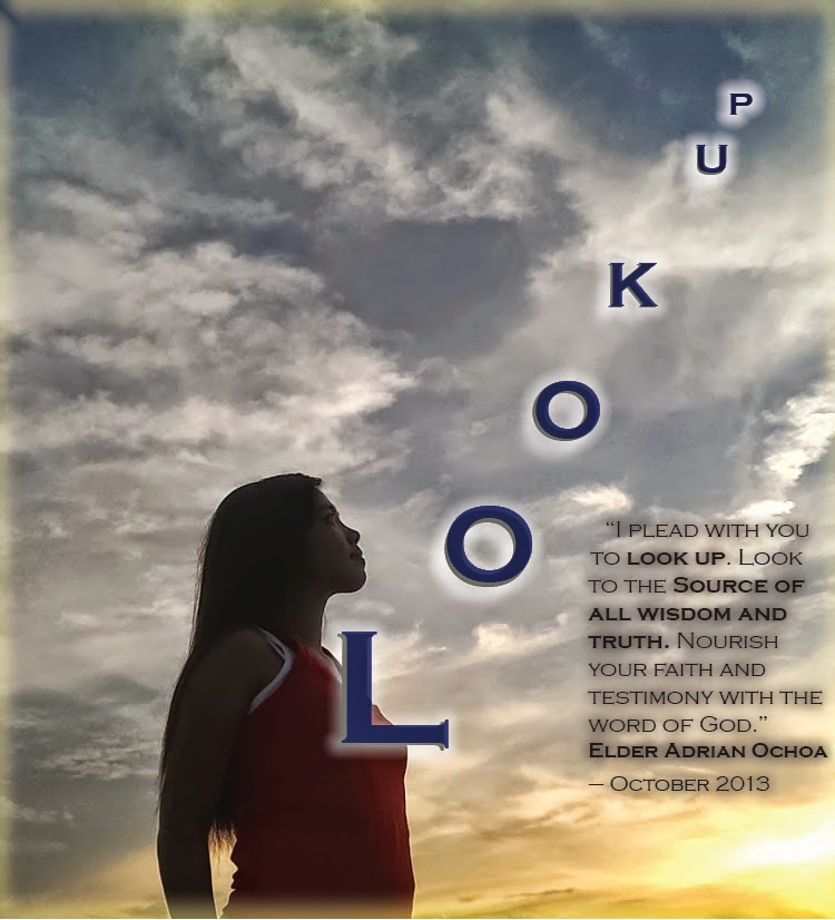
Look up! - Assignment 2. Esteban De Hoyos

The image, the text and the quote indicate to the observers to lift their eyes upwards into heaven. I modified the size and tracking of each letter to create the effect of pointing to the sky. I also put one letter on top of each other with different colors and I added some glow effects. In the quote I emphasized certain words by making them bold.

I commented on Ciera Keller, Spencer Evans, Jordan Wheeler, Samantha Williams and Clarissa Oliphant.

Last time I had commented on: James Birdsall, Bronwyn Burkhardt, Dania Rice, Miranda Ray, and Bryan Pearson.

Assignment #2-Colton Fullmer-Another Opportunity


I hike Mt. Timpanogos this Fall and we were able to see the sunrise from the top. The font I used as Arial Black. I wanted to keep the text simple because I was incorporating the sun as an added letter. I decided to change the color of the text to match the color of the sun. I also turned the sun into the letter "O" to give it more unity with the rest of the image. I photoshopped the letters to be behind the mountain to make it seem like the letters are rising like the sun. Each day brings on another opportunity. As the sun rises, so do your opportunities.

I commented on 5 pictures: Nathan Scoville, Erin O'Sullivan, Eric Slaugh, Madison Houghton, and Clarissa Oliphant

Sunday, October 12, 2014

Assignment #2 - Austin DeLaMare - Remember


The image portrays a sepia/aged photograph symbolic of past memories. I wanted the effect of the photo to represent memories, and how the most memorable moments stay with us throughout time, regardless of how old we get. Although even the details of the best memories tend to fade over time, we never completely forget them. The phrasing “REMEMBER” is written in Helvetica, the most timeless font in existence. It’s a font that many designers use because it continues to have an impact no matter how many years go by. The letters fade out more and more as you read from left to right, but never completely diminish. This parallels the way in which we remember our past: at first we remember all of the details of our beloved memories, but over time those details fade. Nevertheless, it’s best that we remember our memories so that we can learn from the past and create a better future.

I commented on the following 5 images:

Mallory jesperson
Leximayerickson
Ashlyn
Brooke
Hayley Herrera


Saturday, October 11, 2014

Assignment #2 - Steven Dawson - The Great Birth of God


I took a creative risk (isn't that the point of these assignments) and chose a unique typographic example. The "Call to Arms" is hidden in the text of the poem. It wouldn't be a poetry if it didn't make the reader think, and neither would the call to arms be as strong without the effort.

The words can be read vertically or horizontally and it still makes coherent thoughts. I chose Helvetica because I didn't want the font to distract from the meaning of the words. With my limited knowledge of photoshop, I used gradients to try and apply the principles we've been learning and mimic the themes of the poem.

The line and point in the bottom right immediately draw our eyes to the end of the poem, but to read the poem we have to start at the top left, forcing our eyes to move diagonally. I desired this effect because the poem can be read in two dimensions. Also, there is more "white space" near the front of the poem while the "white space" at the end of the poem is actually white, or at least closer to white.

I could spend hours illuminating the meanings, inner meanings, and counter meanings of the poem and how the typography mirrors them, but I won't. Think for yourself. Find your own symbolisms.

Commented on: Mallory Jepserson, Nate Austin, Ceira Keller, Aaron Adams, Bryan Pearson

Assignment Two: Ashlyn Allred, "Travel"

I took this picture in March or April of my friend Camille when we were in England this Spring.  I enhanced the colors of the photo (before it looked more grey).  Then I typed the quote.  I downloaded a thin, sans serif font that I felt looked best.  I also increased the line spacing from 1 to 1.15.  I tried to align the words evenly into the corner and also made it so the quote was above the subtle horizon line.  I also made the attribution smaller than the other words. 

I photos I commented belonged to: James Birdsall, Tanner Wadsworth, Collin Gingrich, Jordan Miki Wheeler, & Madison Houghton. 

Assignment #2 - James Birdsall - Simple Moments


I feel like this picture captures a special moment. It's moments like these that we often overlook. Sometimes a wonder as simple as running through sprinklers is lost when we grow up. I wanted the text to reflect the moment. I made it small because I wanted it to be easily overlooked. In order to read it, you have to focus. I also kept the text fairly simple to keep with the theme of the photo.

I commented on: Mallory Jesperson, Sydney Walton, Maren Owen, Morgan Linford, Spencer Evans.

It Only Takes One- Typography, Assignment #2, Nathan Scovill


From a lifetime of scouting and having walked through more than one forest that had been burned in a wildfire, this is a message that actually appeals to me.

Creating the text involved multiple layers, manipulation of those layers, and manual addition of certain details such as the ashes, and cleaning up unusually rough or discolored edges and roughening edges that were too smooth.

The addition of the smokey the bear in the corner was somewhat last minute, though I like the appearance of him with the match laying on top. I think it's pretty nice.

I wish I had more time to work on it, but I'm going out of town tomorrow and won't be back for a week, so this is what I'm able to upload. Thanks for looking!
-Nathan

Commented on:
Spencer Evans
Ryan Cummings
Heidi Ertel
Taylor Ricks
and Colton Fullmer

Thursday, October 9, 2014

Dare to do- typography Bryan Pearson

I manipulated this photo in photoshop using layers to create the text over the image. I shot the picture in RAW which allowed me to play with the color balance. Because this is a "call to action I chose to edit some elements out of the picture I thought were distracting. The subject had some logos on his pants I chose to take out because it didn't add anything to the photo. I chose to fix a rip in his shirt that was also somewhat distracting. I chose to the the visual do most of the talking and use a few simple words to bring the message home. I want people to get out and do things that they either love to do or have always wanted to do. I chose this picture to illustrate this action because I think it is well composed, the colors are nice and the perspective is unique. After watching Helevetica, I chose to use that font because it is contemporary and simple and think it fits with my message. I commented on the posts of, Ryan Cummings, Lexi Erickson, M’leah Riker, Dania Rice, and Collin Gringrich.

Wednesday, October 1, 2014

Peepin' By: Nate Austin


The way that peep holes make things smaller, but help you focus on a single thing fascinate me. If you look closely you can see the detail that goes into creating a proper peep hole. I like that as you focus in on the the little blue hat you have to ignore the blurriness of the peep hole. In life I think that in order to see things as they really are we have to look past the blurriness or the initial layers to see what is really present.

The Beauty of the Game

This picture is really special to me because of the powerful combination of the beautiful clouds hovering above the field at Lavell Edwards Stadium. I love sports, so any picture of a stadium is really appealing to me. Sports have always been a big part of my life, so anytime I get to attend a sporting event I am reminded of precious memories. In addition, this stadium is even more important to me because of the personal ties I have to BYU. This is where I am at currently in my life. Sports are definitely competitive, but I don't think we often pause to consider the beauty of the games we play. Sports bring people together and are one of the things that make life wonderful. Similarly, sometimes we forget to pause and consider on the beauty of our life. It is sometimes difficult, but it is also filled with joy. In sum, I think this image of a beautiful scene at a sports stadium sheds light on lessons we can take from life.

Maren Owen- Assignment 1 - "Just Around the Corner"


While hiking in Zion National Park with my family, I captured this shot of my dad. We'd been up early in the morning to try and beat the sun, but regardless the sun still came out and began to beat down on us. We stopped to rest in the shade of the mountain before we rounded the corner to face the facade which we were to climb in the full heat of the noonday sun. As my dad looks on just around the corner in anticipation and fear of what will be coming next. This is what I sought to capture. Looking forward to the future ready to face whatever may be ahead. 

Picture Assignment-Austin Page- "Gospel Love"


This scripture from The Book of Mormon has strengthened me throughout all of life’s trials. It influenced my ability to overcome my personal weaknesses and fears. I was able to find great comfort in it while I was deciding to get married, hence the wedding ring casting a shadow in the shape of a heart. Since getting married, I’ve been able to rely on this scripture, my wife, and the promise we’ve made to each other. I believe this picture can display great hope for all who are contemplating marriage! 

Assignment 1 - Jessica Smith - Pure Joy


Laughter and roommates are some of my favorite things, and the two often go together.  The evening has become my favorite time of day.  Somehow we all end up in our front room telling funny stories, watching YouTube videos, dancing whenever someone turns on a song, it all involves laughter.  It's what keeps the stress level down and creates the best memories. This picture is of one of my roommates... I could take a hundred of these on any given day.

Assignment 1 - Reina Trejo - Youth


It's starting to get cold during the day; leaves are changing colors and flowers are starting to die.  I found this row of flowers and decided that it was a perfect visual representation of age and more importantly of youth.  The prominent flower that is in full bloom is hanging onto the summer and its youth.  I hope that I never let go of my inner child so that i can continue to bloom instead of wilting away.
~Reina

Assignment #1-Samantha Thorup- Dancin' in the Rain.


There's a saying that reads: Life isn't about learning to avoid the storm. It's about learning to dance in the rain. I love the idea that even when times get hard, it's our attitude that determines who we are and how we see life. I really believe that life is 20% what happens to you and 80% how you take it. 

In Brigham Young University approved housing each student is required to be provided a desk. Most would fill the drawers with pens, pencils, books, and papers. This is what I fill mine with. My drawer is filled with makeup products. When I'm confident in my appearance I feel like I can accomplish anything. It may seem trivial and superficial to most, but makeup, if used correctly, can help to enhance one's natural beauty.

-Mallory Jesperson

Assignment 1: Burning the Candle at Both Ends


A few nights ago I was up late work on a some homework. It had been a long day and I was stressing out about getting things done. I had a couple projects due, some papers to write and of course readings for every class. Not to mention I work late so my only chance to really sit down and go to work is late at night. After a few hours of going at it I looked around and thought my surroundings just told the story perfectly. From the candle to the clock every small thing in this picture says something. This scene can be found in almost any dorm or apartment in Provo at some point or another. To keep up with everything in college sometimes you have to burn the candle from both ends.

Assigment 1 - Esteban De Hoyos - Sunrise in the air


The hot air balloon was so close to the ground I felt I could touch it. It was early in the morning and the sunrise was so beautiful although not in the picture. I'm sure that the people in the hot air balloon had a tremendous view from above.

The air balloon scene contrasts with the set of cars parked near the library. Nothing special is happening with the cars below, but as soon as I lift up my head I saw the air balloon. Seeing the air balloon in that position and so close to me, it made me feel like I need to sometimes look up and appreciate the good things I have in life.

Doug Heath - Assignment 1 - Friends with Class

I was at a birthday party with all sorts of hustle and bustle when I looked over and saw these two classy gentleman enjoying their conversation. They were separate from the rest of the room. In dress they outclassed everyone else there. However, they were't trying to gather everyone's attention, they were simply enjoying their friendship. Sometimes it's easy to get distracted by everything around you and forget to make time for your friends, but these two clearly made that effort and from the looks on their faces it seems that it was worth it.
I commented on Bronwyn Burkhardt's, Austin DeLaMare's, David Rowe's, Nicole Hale's, and Aaron Hastings' pictures.

Project 1 -- Madison Houghton -- Be Afraid


For this project I decided to try and portray the emotion of Fear. I thought about several different ways to approach this and finally settled on huddling underneath the blankets with just my eyes to communicate the emotion. I turned the photo black and white because it more closely resembles a night time/noir/Alfred Hitchcock setting. The duplication of my face was accidental at first, but then I decided I liked it because it gave more balance to the photo, as well as a hallucinogenic feel to it--which doubles the scary fear factor.

Ps I commented on; Samantha Thorup, Mallory Jesperson, James Birdsall, Jenna Randle, and Alex Skinner.

Assignment #1 - James Birdsall - Look Up


This photo is meant to depict the hope that a temple brings to my life. For me, the temple is what brings me the most hope that one day I'll see my Heavenly Father again. I wanted to capture what happens when we look at the temple spires. The spires draw our eyes heavenward. In a way, I was capturing both of God's homes, the temple and the heavens. The deep blue sky is peaceful and the position of the sun makes the temple emanate light.

Assignment 1 Brooke Adams: #demcollegenights


     I took this photo on September 29, but it could have been from any weeknight at my apartment. By 12:00 on a given school night, at least one sleep-deprived person multitasks studying, web-surfing, and Netflix-watching, while another crashes on the floor (look closer). The sagging couch cushions, pushed-aside textbooks, and too-small DI artwork all support the dismal feeling of knowing you have three more hours of accounting homework, two geology quizzes, and just one more episode in this season of Community (thank heavens there's one roommate with a Netflix and a Hulu Plus subscription). Even the grayish-green hue of the fluorescent lighting sets the tone to experience some of the best nights of your life, provided by your college education.
     Don't get me wrong. Weekends are great too. But this feeling, this picture, this collective experience of full-time students--this is what college is all about.


Assignment 1 -- Bronwyn Burkhardt -- Burn


When looking at this picture, you may not know what to think. That's why I love it. There is so much going on in this tight shot, yet to describe the image in one emotion--except maybe confusion--would be rather difficult. However, I wanted this picture to be direct. In your face. Something you can't easily "un-see." Look closer at that green thing in the middle, and you will notice that it is my beloved green pepper. Life lives on. No matter what is surrounding you, be it fire and brimstone or rainbows and butterflies, life persists, and we must look past those things in our lives. Just like this girl looks at us, we need to look within ourselves and see those things that truly matter.
                                                                                                                                          --Bronwyn

Assignment 1- Collin Gingrich: Hope


When I took this picture I was trying to capture the emotion hope. I took this picture by the Provo Airport facing west toward Utah lake. It had just finished raining and the sun started to poke through the clouds. I feel like this picture is symbolic of how we can find hope even in the darkest of times or during the roughest of storms. The  sun will always shine again. The cool lens flair also made me feel like J.J. Abrams.